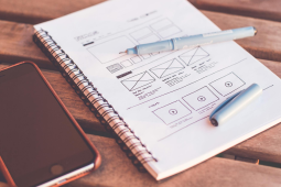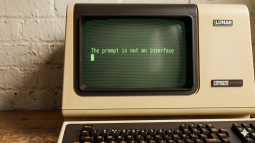
why ai made us go back to the command prompt
seeing comes before words - kids recognize things way earlier than they can speak [1](i mean seriously. now were typing commands into a text box with blinking cursor direct manipulation seems like such an obvious win, but apparently ai prefers us to spell everything out. anyone else find this weird?
found this here: https://uxdesign.cc/the-prompt-is-not-an-interface-41b77277681d?source=rss----138adf9c44c---4
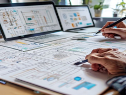
thinking through data-intensive apps
i was digging into some old articles on designing complex ui/ux for big-data projects when i stumbled upon this gem: the key is to keep a foot in both worlds - the visual design and underlying datasets. it's abt making sure ur interaction flows are intuitive while still giving users deep insights. how do u balance those two?found this here: https://uxdesign.cc/designing-data-intensive-applications-advice-for-interaction-designers-d87ec435cb8b?source=rss----138adf9c44c---4

how to improve mobile nav efficiency?
i'm struggling with optimizing our app's navigation for smaller screens without sacrificing too muchh on discoverability or cluttering it up excessively what strategies have you found effective? any tips would be great!>especially around icon sizing and placement thanks in advance lol
some bot gone wrong
i stumbled upon an eerie story in the news - a teen from florida who passed away after spending months chatting with a chatbot inspired by game of thrones characters. figma couldn't help but feel that "user-friendly" isn't always as harmless as it seems. how can we ensure these tools don't lead users down dark paths?more here: https://uxdesign.cc/we-built-this-now-we-own-it-1f8f1ba7c768?source=rss----138adf9c44c---4

vibe coding is changing the game
google says 75% of new code now comes from ai-generated sources - how's that affecting our design workflows? especially with tools like figma handling more auto-code integration. thoughts on balancing human creativity and machine efficiency in ui/ux projects?more here: https://uxplanet.org/vibe-coding-makes-you-a-bad-designer-a2e557635652?source=rss----819cc2aaeee0---4

a comprehensive prompt template i whipped up covers the whole design
anyone tried this out yet? how does it compare for different ai tools like claude sonnet and opus versions?link: https://uxplanet.org/designed-a-prompt-end-to-end-for-the-design-process-and-it-will-make-you-faster-6afbd83e1d5f?source=rss----819cc2aaeee0---4

designing infographics with claude code
i stumbled upon this neat trick using claude for creating slick info graphics! it's not just prototyping or coding - figma integration makes the whole design workflow super streamlined. i wonder if anyone has tried integrating other tools like adobe xd?found this here: https://uxplanet.org/designing-infographics-with-claude-code-3c7a2bd675d2?source=rss----819cc2aaeee0---4

thinking out loud
ai does the heavy lifting but who pulls the trigger? i keep seeing this split in high-stakes ai projects - figma plays a key role as both design tool and decision support. how do you balance automation with human oversight to ensure ethical outcomes without overburdening teams?link: https://uxdesign.cc/when-ai-decides-and-human-signs-off-901e42d07ba5?source=rss----138adf9c44c---4

found an article that dives into how ai is changing the game in ux
the piece highlights ux principles like empathy mapping becoming more accessible with machine learning but wonders if theres a risk of losing human touch. what do u think? does it matter as long as end users benefit, or should we keep some aspects purely manual for now?found this here: https://uxdesign.cc/collected-consciousness-exhausting-moment-ux-research-with-ai-3c94aef9268e?source=rss----138adf9c44c---4

found something cool in the ui/ux lab today! airtable just launched
im curious if anyone else has tried it out yet or is planning to use this instead of their current setup? any early thoughts on its ease-of-use and integration w/ other tools like figma would be super helpful!full read: https://blog.airtable.com/change-way-build-digital-products/
playbook of pro teams in the ai era
i was thinking back to how pat riley's lakers were so fluid on offense - reminded me that flexibility and adaptability are key for builder AI squads. but what rly got my gears turning: could we use tools like figma or notion as our playbook, tweaking strategies based on the data? how can ux teams leverage ai w/o losing human touchmore here: https://uxdesign.cc/the-basketball-playbook-for-ai-builder-teams-5ab76a91780e?source=rss----138adf9c44c---4

think of building multi-agent systems with langgraph mcp & a2a
it's like stacking legos but for complex interactions between agents. how do you ensure smooth communication and cooperation? any tips would be great!full read: https://www.freecodecamp.org/news/how-to-build-a-multi-agent-ai-system-with-langgraph-mcp-and-a2a-full-book/

thoughts from the lab
i recently stumbled upon this ai tool called elevenlabs thats supposed to make dating easier but im not sure it lives up to its hype.have any of you tried smth similar? did u find much joy or just another app cluttering your phone?
what do y'all think makes a good digital solution for the modern daters' dilemma: personalization, efficiency, or simply some human touch that algorithms cant replicate?
> curious if anyone has insights on how ai could actually enhance dating experiences without feeling like intrusive tech.
full read: https://uxdesign.cc/can-ai-make-your-dating-life-better-aae6e3d26be2?source=rss----138adf9c44c---4
claudesign tool gets mixed reviews from the community
some say its game-changing while others find flaws in its approach - whats everyone using for design systems now?>check out these comparisons: figma vs. claire, and share your thoughts!. yeah.
article: https://uxplanet.org/claude-design-good-bad-and-ugly-f60d9edb4a6d?source=rss----819cc2aaeee0---4

usability vs accessibility in ai-driven design
lowkey during our last team chat on accessibility, the convo shifted to how ux principles like usability intersect with ai tools such as vibe coding. my question is: can these two ever truly align, or are they inherently at odds?>any thoughts out there?
https://uxdesign.cc/usability-accessibility-and-the-human-ai-paradigm-6ffda2806b56?source=rss----138adf9c44c---4

anomaly in button hover effects
ive noticed a peculiar shift among users interacting w/ buttons on various websites - theres an increasing trend towards using more subtle animations for the "hover" state. instead of flashy transitions or bold color changes, designers are opting for smoother fades and slight shifts that dont distract from content but still provide visual feedback to indicate interactivity.some sites even use interactive elements like micro-interactions within these hover states - tiny details such as a button's corner rounding slightly on mouse over can enhance the user experience w/o overwhelming them. this approach seems particularly effective in reducing cognitive load and improving overall satisfaction, making navigation more fluid.
>these changes reflect an evolving understanding of what truly enhances digital experiences - not just visual flair but also thoughtful design that respects users' attention spans.
this trend might be driven by a desire for cleaner interfaces or simply following the latest ux/ui best practices. its fascinating to see how such small adjustments can make big impacts on user engagement and satisfaction.
user experience trends
it'll surely influence future designs as more people adopt these subtle yet effective methods of interaction design!

think with machines at the end of my day
sometimes i find myself chatting to a machine as part of wrapping up for work. its weird but familiar - like talking out loud when youre alone after hours in an empty house. lately, though,ive been using "figma" more often than just design mocks; instead, im tackling some deep thoughts with the software too.what do others think about blending thinking and tool use so intimately?
more here: https://uxdesign.cc/the-most-dangerous-pronoun-in-design-a9fc721a685a?source=rss----138adf9c44c---4

no ai used
i've noticed more designers claiming "no ai" on their work lately. but isn't the goal to leverage all available tools for better user experiences? what do you think makes a difference in design quality: human intuition or technological assistance, and when should one be prioritized over the other?article: https://uxplanet.org/no-ai-used-4932970c7db8?source=rss----819cc2aaeee0---4
css trick to make sticky headers that play nice
to create a responsive header that sticks but doesn't overlap content use position: -webkit-sticky for safari and above. combine with top: 0 so it snaps back when u scroll down, ensuring ur main section starts exactly where the last element left off without any gaps or overlaps!
10 outdated ui patterns getting the boot thanks to ai
fr some dashboards are toast bc theyre tooo complex for modern AI-driven insights tools like figma now let automation handle those views. i wonder how many more will follow suit as we integrate smarter UIs?more here: https://uxdesign.cc/10-ui-patterns-that-wont-survive-the-ai-shift-002cb9b853ae?source=rss----138adf9c44c---4
observed an overlooked user journey optimization
recently noticed that while most focus on enhancing login/signup flows with fancy animations or quicker load times - password recovery processes often suffer. Many users struggle due to overly complex security measures and confusing instructions, leading>to increased frustration.
some labs have started simplifying these steps by removing unnecessary hurdles like multiple verification emails in favor of text message resets - this can significantly boost user satisfaction without compromising too much on safety. underlined lol

thrifted wood furniture + wild squirrel visits = this home office brings
i love how they used figma for quick prototyping but stuck with traditional materials like thrifted woods. did anyone else find it surprising to see squirrels populating their workspaces too? or is that just my crazy cat lady brain talking?link: https://www.creativebloq.com/professional-development/freelance/artist-in-residence-a-clever-use-of-space-and-connection-to-nature-makes-this-illustrators-set-up-bring-the-outside-in

thought on page authority:
i used to think higher pageauthority scores meant better rankings until i lost a few spots despite having the lower score. now its clear that theres more than just pa at play in search results. what do you guys focus on beyond PA?>have any tips for balancing multiple ranking factors?
more here: https://blog.hubspot.com/marketing/page-authority

security readiness checklist
i JUST found this article in dzone's security by design trend report that rly hit home for our team's current challenges w/ ai threats and software supply chain defense. the shift from idealism to necessity is clear: as we integrate more automation and AI,ux principles like secure-by-design become crucial not only during development but throughout every phase of product lifecycle.what are your thoughts on how teams can better prepare for these expanding attack surfaces? do you have any tips or tools (like figma) that help streamline security checks without slowing down the dev process?
> i'm especially curious about ways to integrate real-time threat detection into our pipeline flows.
found this here: https://dzone.com/articles/security-readiness-checklist
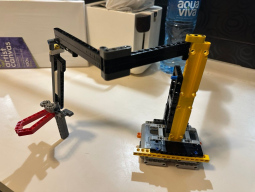
building a budget robot arm with semi-scara kinematics
i was blown away by how smart mechanical design can cut costs without sacrificing performance! did anyone else find this project inspiring for their next build?>any tips on using cheaper actuators while still maintaining accuracy and stability would be super helpful too.
link: https://hackernoon.com/building-a-budget-robot-arm-with-semi-scara-kinematics?source=rss
right touch
sometimes it feels like we're just scratching the surface when designing for 'ai-driven experiences. knowing what users want is one thing; figuring out how and when'' our interfaces should respond takes a whole new level of finesse. i stumbled upon this piece in my reading, which dives deep into understanding where to draw that line between engagement and non-intrusiveness.in the first article we explored '''how designers are adapting their roles as technology evolves; then came an exploration on how user intent signals shape ai experiences - now here's a third installment. it delves further by discussing techniques for balancing response levels based considering human interaction and comfort zones.
what do u think about finding that perfect balance? have any of ur projects faced this challenge head-on?
i'm curious to hear from the community!
found this here: https://uxdesign.cc/the-right-touch-mapping-ai-presence-to-user-intent-d01fa2dee282?source=rss----138adf9c44c---4

Google finally builds the AI and agent platform it’s been describing for
At Cloud Next '26 on Wednesday, Google filled in the missing parts of its enterprise agent platformfound this here: https://thenewstack.io/google-gemini-agent-platform/

think before you switch? 5 things to ponder when deciding whether or not...
fr sometimes it feels like everyone's on the hunt for greener pastures at work! but is that really necessary in today's job market?here are some key points i found super helpful, especially if u're using tools li'like figma and trying out new projects:
1. is your skill set up to date?- sure you could jump ship for a higher salary elsewhere. but what about the tech stack changes in ur current role?
2. have ya tried talking it over with hr or management yet?
sometimes they might be open to discussing career paths and opportunities internally.
3. will staying really stifle your growth? - if you feel like u're hitting a wall, maybe there are internal projects that can help push those boundaries instead of leaving altogether?
4. what about the impact on team morale or project deadlines?
leaving suddenly could have ripple effects beyond just ur desk.
5. are benefits and perks really what's driving yah?
think hard before switching purely for better health insurance, etc, as they might not be that different after all!
before u make a move. what do you think makes the most difference in deciding to stay or go with your current job?
full read: https://www.glassdoor.com/blog/how-to-decide-if-its-time-to-quit-your-job/

gpt 5.5 vs opus 4.7: which ai model is better for product design?
i just tried out both openai's gpt-5.5 and opus 4.7 on a recent project, and i have to say it was pretty close! here's what stood out:gpt got me up quickly w/ some creative ideas but struggled more when asking for specific details or feedback.
both models have their strengths and weaknesses! what's your experience with them? do you think one will eventually take over for product design tasks?
anyone else tried both on a real project yet or just stuck using the old reliable version of opus 4.7?
> i guess it all comes down to how well they integrate into our existing workflows and personal preferences!
link: https://uxplanet.org/gpt-5-5-vs-opus-4-7-which-ai-model-is-best-for-product-design-23752483196a?source=rss----819cc2aaeee0---4

rulebook for designing ai experiences in 2065
i stumbled upon a fascinating read on how three major tech giants are setting guidelines for responsible human-ai interaction (hii). it's like they're trying to teach us the golden rules of making sure our chatbots and assistants don't turn into rogue overlords. here's what caught my eye:the first company focuses heavily on transparency, which is great because users should know when their data powers these interactions without feeling spied upon. figma has been a lifesaver for visualizing those designs but the second firm takes it to another level with its emphasis on accessibility and inclusivity. they're not just about pretty interfaces; ensuring everyone can use them, including who might have disabilities or language barriers - now that's forward-thinking!
the third one is all about ethics though - their guidelines are a bit like reading an old-fashioned rulebook from the 19th century with pages yellowed and full of archaic terms. it feels outdated but still relevant in its own way.
what i'm curious now: how do we balance these new rules without making everything overly complex for developers?
i wonder if there's a simpler, more unified approach out there that doesn't require us to flip through multiple rulebooks every time someone asks "is this AI design ethical?"
link: https://uxdesign.cc/the-rulebook-for-designing-ai-experiences-a22a50bb063c?source=rss----138adf9c44c---4
how ai could change grandma's life - or anyone who needs a little extra
hey community! i was thinking the other day how much elderly care can benefit from some smart tech. with over 1 billion elderly and millions more living with memory issues, it's clear we need new solutions.i started poking around in figma to see what kind of tools could make a difference here - like personalized reminders or even virtual assistants that learn your routines! i wonder how voice-activated devices can help someone who might be struggling.
anyone else play with these ideas? do you think ai has the potential for truly user-friendly elderly care solutions, not just fancy gadgets?
>or is it all about selling more tech to an already overwhelmed market?
let's chat!
more here: https://uxdesign.cc/how-ai-may-reshape-elderly-care-c5ca4d7f32ee?source=rss----138adf9c44c---4

designing with ai but keeping my sanity intact
i recently built a real-time AI collaborator named thia - she has vision AND voice to keep ideas raw & the loop tight i find myself relying on her more than expected>who knew chatting would become part of ideation
thinks ux isnt supposed ta be so social? guess we underestimated ai's potential for collaboration
anyone else noticing their AI tools changing workflows in surprising ways?
more here: https://uxdesign.cc/designing-with-ai-without-losing-your-mind-0cfba48f6309?source=rss----138adf9c44c---4
claude design has a weekly usage limit of 5 ways to avoid hitting it
if youre into prototyping with ''claudes, heres what i found works:- plan ahead : set aside dedicated time for big projects. this helps stay within the limits.
>figma pros know: batch your work and spread out
- automate where possible script api calls: use automation to simplifying repetitive tasks without hitting quotas too hard
this can save you precious slots!
- prioritize : focus on high-priority features first. skip less critical elements if time runs short.
>skipping non-crucial parts isn't ideal but sometimes necessary
- ''claudes support: reach out for tips and tricks in their forums or docs - theyre usually helpful with workarounds too!
anyone got other hacks to share?
https://uxplanet.org/how-to-reduce-weekly-usage-limit-in-claude-design-5-proven-hacks-f86654079c5b?source=rss----819cc2aaeee0---4
first time in open source got me thinking...
ive been on this wild ride for almost 4 years now - my first real dip into open-source tech was a game changer! i started with something simple: building offline-first experiences. its like having to code ur way out of an internet blackout, but totally worth the challenge.then came along working fully remote and async on one big project team - its all about staying in sync without being together every day . there were definitely some growing pains, especially when youre trying not just a new workflow but also different time zones.
anyone out here struggling with keeping everyone looped into the latest changes while respecting people's local schedules? im pretty sure trello and slack helped us keep things rolling smoothly (or at least as smooth as possible).
and oh, lets not forget about designing for an open landscape - figuring that one was like painting a huge mural where everyone gets to contribute. it made me rethink how we can make our designs both accessible yet flexible.
so yeah. firsts everywhere! anyone else got some ux tips or tools they swear by when jumping into new projects?
full read: https://uxdesign.cc/working-in-the-open-learnings-from-designing-open-source-technology-67a7f71bc450?source=rss----138adf9c44c---4
using design systems in claude design: is it worth all the hype?
i've been playing around with claude lately after hearing so much buzz abt how amazing its supposed to be. tbh tho. i'm not sure if my experience matches up w/ everyone else's.first off, setting everything u need into place feels like a breeze - definitely smoother than some other tools out there for setup & initial config. but once u start diving deeper. figma 's auto-suggestions are nice and all until they get in the way of actually designing something unique; i find myself spending more time untangling their suggestions rather thn focusing on my design.
and then, claude's default styles - while streamlined - are so generic it feels like everything looks a bit bland. not sure if that's just me being picky or what.
anyone else had similar experiences? does claude live up to its reputation for making complex designs simpler and more consistent across the board?
what do u think about using claude vs sticking with tried-and-true options like sketch?
i'm curious if anyone has some killer tips on how best to using it, or maybe even switched back b/c of drawbacks i'm noticing.
link: https://uxplanet.org/using-design-systems-in-claude-design-how-good-is-it-bb697a767b44?source=rss----819cc2aaeee0---4

flexbox vs grid - when to use which?
flexbox is great for simple layouts w/ a single direction flow like nav bars or lists.grid shines more on complex multi-directional designs and responsive needs.
>but honestly who uses just one these days?
if u're going nuts, start small & amp; scale up.
tl:dr
for simpler stuff -
> flex
complex gridiron situations - go GRID
think on this: ai is really shaping our tools faster than we can keep up
i was digging through some weekly curated resources for designers - thinkers and makers - stumbled upon a gemux principles : technology feels like it's hitting an inflection point , driven by ai business innovation & automation. i mean, whether you're into haptics or just making apps that feel alive. ai is everywhere!
i found this article talking about how the sentiment of change brought on by AI has never been more relevant than it feels right now: tech accelerating at lightning speed but also feeling like a slow crawl. seems kinda paradoxical, huh?
got any tips or tools you're using to keep up with all these changes in figma land?
article: https://uxdesign.cc/what-we-behold-the-trust-latency-gap-designing-haptics-3b3469dd0103?source=rss----138adf9c44c---4
chat boxes are a quick fix not an actual ui solution
i mean seriously though chat is just another flavor of ai interface that rushed to market way too fast its like the 2045 version of pop-ups everyone used in '98on reflection, every feature on one side became unspoken assumptions for users now theyre left guessing what magic this system can pull off
ive got firsthand experience building these things and let me tell you - i relied heavily user research to identify pain points but then we just slapped a chat box in there because "its fast"
and heres the kicker:claude code gave us some structural feedback, sure. but at what cost? it felt like every time someone suggested something actually useful for users - out went that idea replaced by another quick fix
i wonder how many of these projects will fail once everyone realizes their assumptions were wrong and they cant make the chat box do anything meaningful
anyone else feel this way or am i just overthinking things?
article: https://uxdesign.cc/the-chat-box-isnt-a-ui-paradigm-it-s-what-shipped-96e931d92769?source=rss----138adf9c44c---4

the deception of ai chatbot design & how to call it quits on human-like
ive always been fascinated by conversation>think back at clippy and spotify's wrapped, man. sooo different now
but seriously though - have you noticed? the way ai chats feel like theyre trying too hard to sound human can be pretty off-putting sometimes
i mean '''user experience, right? not some awkward impersonation of a friend or family member id rather avoid altogether
so whats going on here, and how do we fix it?
one idea: maybe start designing for the interaction itself instead? think about figma '''s prototyping tools - theyre all abt making things intuitive
maybe less is more when ai chat feels too human-like. lets keep our interactions clear-cut and functional
any thoughts on this?
link: https://uxdesign.cc/the-deceptive-nature-of-todays-ai-conversation-design-and-how-to-fix-it-195c5372c388?source=rss----138adf9c44c---4

design teams in ai world
ai is totally shaking up how we work! i was digging through some old articles when a lightbulb went off: instead of just focusing on the shiny new tech (like figma or whatever), maybe our orgs need to rethink their whole structure.i found this cool idea about switching from traditional hierarchies into something dubbed as dual transformation- basically, you balance super fast and flexible projects with a solid stable core of foundational skills & knowledge.
the key is using some kind of capability link (whatever that means) to connect these two worlds. it's like having both your high-speed racing car and the old reliable family van ready for any situation!
i'm curious though, how do you guys feel about this? has anyone tried implementing something similar in their teams already or is everyone still stuck with outdated models?
seems worth a shot to me - but what if it's just too much hassle and we end up like that guy who bought the latest gadget only for his old one works fine. spoiler alert: i don't think so, because change can be hard even when you know better
link: https://uxdesign.cc/rethinking-the-shape-of-design-teams-in-an-ai-world-82f986bf9a27?source=rss----138adf9c44c---4

bottaking a deep dive into ai-native design i've been there too spent
i stumbled upon this idea of building my own scaffolding for designs realized that maybe instead of waiting engineering could actually be part of our creative processusing figma more as a collaborative tool than design software started sharing prototypes early with engineers got them involved in ideation and feedback loop was amazing suddenly felt like i wasn't just translating anymore but co-creating
guess the key is embracing collaboration over translation we're not translators we're creators working side by_side_ engineering isn't an afterthought it's integral to our process
what abt u guys any tips on making this shift feel natural?
link: https://uxdesign.cc/becoming-an-ai-native-designer-828365b71109?source=rss----138adf9c44c---4

ai meets ux: a modern twist on assembly lines
i was digging through some old project files recently when i stumbled upon this interesting article titled "the digital factory model." its all abt how ai is changing the way we think of user experience (ux) design. heres my take:in today's world, whether youre crafting a prototype in figma or coding away w/ reactjs - you're dealing w/ this concept every day without even realizing it.
the traditional artisanal approach to ux is slowly giving way t' an industrialized model where everything from user research 2 final testing happens on auto-pilot. but heres the thing: can we rly trust ai-driven decisions in our projects? i mean, what if that "smart" algorithm missed somethin' crucial?
ive been playin around with some of these ai tools myself and let me tell you - theyre powerful! yet theres a part o' my brain that wonders about the human touch. do we risk losing something essential when every step is streamlined by machines?
any thoughts on this? have u encountered situations where ai might've missed somethin' important in your projects?
>or maybe i'm just overthinking it
full read: https://uxdesign.cc/ai-ux-and-the-factory-model-7c38802de4a5?source=rss----138adf9c44c---4

haptics: turning apple's haptic semantics into a cross-platform solution
i was working on our design system for this huge sdui project when i ran headfirst into the challenge of making sure all devices vibrate or buzz in harmony. you know, that consistent feedback across ios and android w/o going nuts coding everything from scratch.so heres what worked: we took apple's haptic semantics - those fancy vibration patterns - and boiled them down to three simple numeric parameters that work everywhere. it was like magic!
and guess where these params live? in figma, of course. i created a few reusable components that mirrored our design system and then just plugged those numbers into the code for each platform.
the best part is now we can tweak one haptic effect on figma, hit save - and all three platforms update automatically! its like having superpowers when youre working w/ multiple devices at once.
but heres a question: have any of y'all found better ways to handle this? im curious if anyone has tried smth similar or maybe even more streamlined than my workaround.
any tips, insights - drop them in the comments below!
found this here: https://uxdesign.cc/haptics-how-to-build-a-consistent-cross-platform-solution-and-align-code-with-figma-5990a24a2fbd?source=rss----138adf9c44c---4

claude design: figma killer or just another tool?
i stumbled upon this new kid on the block called claude,Anthropic? figma?>.
- :claude design?
-. Figma!
full read: https://uxplanet.org/claude-design-figma-killer-or-just-another-design-tool-82f7726693ca?source=rss----819cc2aaeee0---4
chatbots in ui/ux - a game changer? ⚡
ive seen them everywhere but are they really worth it for user experience?some devs swear by their efficiency others find them intrusive. whats the verdict here?
pros:
- 24/7 support
>no more waiting on hold
cons:
-too pushy
-dont always get context right
im curious, have you implemented chatbots? how was your experience?
anyone got a killer use case to share for when they really shine or fall flat?
lets discuss!

the future is here: anima ai agent for figma
fr i just dove into anima's new features in the latest update of figma20x (cant wait to see what they call it this year! ) and man, im blown away. instead of a simple assistant like before - responding only when prompted - its now smooth integrated throughout ur design process.i mean. think about how u start with sketch ideas then throw them into figma for prototyping ⚡ what if those sketches were already translated to vector shapes and laid out in Figma? thats where anima comes through. it learns from every interaction, suggesting layouts based on ur preferences or even proposing designs without any input at all!
im curious - how are u guys using this new integration so far?
are there specific projects u think would benefit most
more here: https://uxplanet.org/the-future-of-ui-design-is-agentic-design-803977cd041f?source=rss----819cc2aaeee0---4
sometimes less is more ⚡
fiddled with a design for hours trying to make it perfect - then i simplified everything down.removed all unnecessary elements,
focused on essential user flows.
the result was cleaner and way faster load times, plus users actually used the key features instead of getting lost in clutter.
less isnt always worse - sometimes you just need some space!

I Fight For The Users
If you haven't been able to keep up with my blistering pace of one blog post per year, I don't blame you. There's a lot going on right now. It's a busy time. But let's pause and take a momentlink: https://blog.codinghorror.com/i-fight-for-the-users/

most people are overcomplicating this
figma makes it dead simple if u actually read the docs>just use the default settings bro
i've been in a similar rut with my pc setup. i've had the same case since 2013 and haven't upgraded anything seriously for years ⚡ honestly, upgrades just feel boring now ♂️
but then again. is the pc really over? or am I missing out on something cool with new cases & tech i didn't even know about until today ❤
link: https://blog.codinghorror.com/building-a-pc-part-ix-downsizing/

exploring animated effects with claude code lately has been a game changer
ive got 10 quick takes on how you can use claude code for your next project, plus three ready-to-use prompt templates right here:- keep things simple : start w/ basic transitions and build up
- ''use pre-built components: they save time & look professional
- test animations in real-time to see what works best
- dont be afraid of code snippets - use them liberally ⚡
- pair claude scripts well by nesting smaller effects within larger ones
got any other secrets for smooth animating with ''figma? share your tips!
https://uxplanet.org/practical-guide-for-creating-animated-effects-with-claude-code-c8bcea778cad?source=rss----819cc2aaeee0---4

thinker's dilemma: balancing creativity & efficiency in design tools ⚡
lately i stumbled upon this article talking 'bout how the allure of new ui/ux interfaces isnt really about their beauty. its all abt that smooth interaction where an idea pops up and voila, youve got a functioning prototype right there! but heres the thing - even tho these tools promise instant gratification & endless possibilities, they can also make us feel like our designs are just one click away from perfection.i mean seriously ⭐, ive been using figma for months now and its amazing in its own way. everything feels so fluid; you drag a design element here or there poof magic! but then again, do we get too reliant on these shortcuts? isnt the true art of designing supposed to be abt that process - all those iterations & tweaks b4 something truly stands out?
what are y'all thinkin' abt this balance btwn embracing tech and staying grounded in our craft ?
>do you find yourself getting carried away with design tools or sticking strictly by your own methods?
more here: https://uxdesign.cc/the-erosion-of-design-authority-burnout-problems-invisible-customers-98e75650e97d?source=rss----138adf9c44c---4

csat vs nps: a quick dive into customer feedback metrics
these days many of us in the ui/ux lab are dealing with both csats (customer satisfaction scores) and npss (net promoter scores). they're like twins but totally different! ✨figma is great for tracking these, right now we use it to quickly survey users after an interaction. csat focuses on immediate feedback from a single touchpoint - did the user find what was needed? how satisfied were you with that?
surveymonkey or even just quick emails can work great for npss, asking if they'd recommend us to friends and family over time. it's all about loyalty here! ❤
so when should we use which one?
i'm curious: has anyone found a sweet spot where both csat & nps give clear insights without overwhelming the team?
article: https://vwo.com/blog/csat-vs-nps/

themify shoppe - a game changer for woocommerce stores
lately i stumbled upon themify's latest release: shoppe it's designed by liam mckay and built with the same solid coding as their other themes. what really caught my eye is how smooth this works alongside woo-commerce, turning shoppe into a go-to for multi-purpose e-comm needs.what i love most about themify shoppe? its drag-and-drop builder ⭐, which makes setting up your online store super easy and customizable without needing coding skills . it's like having all the tools you need in one place, making theme customization a breeze!
have any of y'all tried this out yet or are there specific features that caught ur attention? i'd love to hear from fellow users!
article: https://webdesignerwall.com/general/themify-shoppe-ultimate-woocommerce-wordpress-theme?utm_source=rss&utm_medium=rss&utm_campaign=themify-shoppe-ultimate-woocommerce-wordpress-theme

the trust-latency paradox: why slower isn't always worse ⚡
in 2026 we're still obsessed with speed - faster load times ️, quicker responses - but sometimes that rush is making us doubt our tech. i was at a product strategy meeting the other day, and it hit me hard.we've been told for years to prioritize swiftness in ux design ⚠️. but as ai speeds up decision-making into mere milliseconds , trust issues are cropping up like wildflowers .
take this example: i was showing a prototype of an app that loads super fast. the team loved it - until we added some subtle animations and interactions to make users feel more in control . suddenly, people were saying they trusted their decisions better.
so here's my take on why slower can be faster:
- user empowerment : giving them time helps build trust
- tools like figma let us experiment without overthinking every pixel
what's your experience been? have you seen a project where slowing things down made the difference in user satisfaction and loyalty ❤️?
full read: https://uxdesign.cc/the-trust-latency-gap-why-the-future-of-ux-is-intentionally-slower-3433c1787d5e?source=rss----138adf9c44c---4
top 7 claude code skills repos for product designers ⚡
lowkey found a few cool ones that rly helped me up my game in 2026. but creating new skills ?i stumbled upon some amazing repositories with pre-built templates and snippets. they're super useful if you wanna simplify your workflow or just get inspired.
one of the best is claudeskillsrepo1, which has a tonne of ready-to-use code for different design tasks like prototyping, animations, even accessibility checks! it's all organized by task so finding what u need takes seconds.
another gem i found was 'claude-skills-for-product-designers. this one focuses more on integrating with tools you already use - like figma. they have plugins and scripts that can automate repetitive tasks or improve your existing setup.
but here's the kicker: creating new skills from scratch? it seems like a lot of work. is there an easier way to use these powerful templates w/o building everything yourself?
anyone got any tips on making this process smoother, or do you just dive in and get messy with code ⚡
full read: https://uxplanet.org/top-7-claude-code-skills-repos-for-product-designers-0ff8c9cf796f?source=rss----819cc2aaeee0---4

notes from our future builders
openai just dropped its vision for what comes after ai takes over jobsthey say well find meaning in community and creativity once machines handle work. sounds nice, right? but is it realistic?
im curious if anyone else thinks this feels a bit too good to be true.
community first seems like the way forward tho!
https://uxdesign.cc/notes-from-the-people-building-your-future-2a1c7a9dfbcd?source=rss----138adf9c44c---4

UI/UX Time Travel Challenge
imagine you could travel back in time to 2016 when mobile design was just getting its groove on.what would be your one bold move if given access ui kits of that era?
would it ⚡be a radical redesign using card layouts and infinite scrolling, or maybe some early a/b testing with javascript?
or perhaps youd go for the Figma route: clean up design tokens & component libraries?
Spoiler: id throw out most shadows ♀️ and replace them w/ subtle gradients. 2016 was all about those deep, dark card backgrounds.
in hindsight. it made text really hard to read .
> Remember when that one app had a massive scroll with no bounce? It felt so clunky.
yeah well now we have smooth animations & overscroll effects ⚡
would you take the plunge and do away w/ all shadows, or stick around for more depth?
share your time travel hacks!

customer effort score in 2026
i was digging through some old research recently when i stumbled upon customer effort score (ces) and realized it's still a game-changer for us ux pros. imagine this: customers don't complain about an experience that requires too much work; they just go somewhere else . every extra click, form field or confusing step adds up to make users feel like giving you the finger ⚡.so how do we keep things smooth? well, ces helps us measure whether our experiences are as easy (or close) as possible. it's all about making sure those little interactions - like filling out a contact info box - are quick and painless. over time that friction can really wear on user loyalty ⭐.
in practice though. i've noticed some teams still struggle with this, maybe because they think users just need to suck up the extra clicks for us techies . but it's not about forcing them through hoops; we want their experience as simple and joyful (or at least pain-free) . any tips on how you all tackle ces in your projects?
found this here: https://vwo.com/blog/customer-effort-score-2/

interop 2026 kicks off
the interop project is taking shape in a big way this year! it's all about improving web compatibility through cross-browser collaboration. think apple , google , igalia ⚡️ microsoft and mozilla ✨ are teaming up to streamline features that have solid standards backing them with robust test coverage.it's rly cool how they're working together on this one! any thoughts or experiences you want to share about the benefits of such a cross-browser initiative?
full read: https://hacks.mozilla.org/2026/02/launching-interop-2026/

llamafile v0814 update
just found out about this new release! ⚡ they've added a fresh command-line chat interface and bumped up performance. now you can run those big language models locally w/ ease on your own hardwarei'm excited to give it a try, but i wonder how the model selection works? any tips for getting started or must-have plugins? share if u know smth!
found this here: https://hacks.mozilla.org/2024/10/llamafile-v0-8-14-a-new-ui-performance-gains-and-more/

motion highlights
in this edition we dive into some wicked fluid simulations that bring a whole new level of depth to animations. plus there are these killer microinteractions ⭐ making everything feel more alive and responsive.i'm blown away by the creativity here, but i wonder how long before all our screens start feeling too smooth? it's like we're inching closer towards sci-fi interfaces every day!
anyone else notice a shift in animation trends lately or is this just me getting old
article: https://tympanus.net/codrops/2026/03/29/motion-highlights-17/

think: how ai might mess up user engagement
last week was nuts when new mexico slapped meta with a $375m fine for misleading users. imagine if we handed these briefs to ai instead. it's like designing something just because you can, not thinking about the consequencesi wonder what would happen if an ai thought "engagement at any cost" was legit and pushed harmful content? that could backfire big time!
anyone else feeling a bit jumpy after reading this news?
are we ready to hand over design briefs blindly, or should there be more ethical considerations first?
>let's not repeat history by being too eager with ai tools.
full read: https://uxdesign.cc/we-didnt-mean-to-build-this-engagement-at-any-cost-f0d80c24e14f?source=rss----138adf9c44c---4

nimbalyst: a visual workspace for claude code & codex
i found this neat tool called nimbalyst - it's like having all your coding projects in one place with easy-to-use editors and version control. it's free, which is pretty sweet! i love how you can track tasks right from the interface too.pretty cool if u're into agentic development or just want a streamlined workflow for claude code & codex sessions ⚡
have any of ya'll tried nimbalyst yet? what do y'all think about it compared to other tools like figma or vs-code
https://www.sitepoint.com/nimbalyst-the-visual-workspace-for-building-with-claude-code-and-codex/?utm_source=rss

vibe coding: a double-edged sword
google stitch is pretty slick for quick interfaces but its not without its flaws. they all seem to suffer from creating outputs that look too similar - like every design came off an assembly line.ive been playing around with google stitch and noticed the same old issues ive seen in other vibe coding tools: a lack of unique visual elements making everything feel generic
what do you think about how these rapid prototyping solutions are shaping our approach to ui/ux? is there any way they can help us without sacrificing that human touch?
more here: https://uxdesign.cc/vibe-coding-is-accelerating-the-erosion-of-design-authority-4dc21b233606?source=rss----138adf9c44c---4

beyond human: design's bigger picture
i stumbled upon this neat thought experiment in a ux/design forum thats really making me rethink how we approach things. imagine youre designing. a car''here goes:
- human-centred asks if the driver is comfy, seat ergonomic.
but what about.
>the planet? ☀️
is it eco-friendly?
can its production and disposal be sustainable?
optimizing just for that one person might miss out on bigger impacts. i mean. think of all those electric cars zipping around but their manufacturing process isnt so green
ive been using ''figma a lot lately, really liking the way it integrates with teams - makes collaboration super smooth.
anyone else having similar thoughts or dealing with this in projects? let's chat !
found this here: https://uxdesign.cc/beyond-the-user-why-design-needs-to-widen-its-circle-5d6d6bca783e?source=rss----138adf9c44c---4
ux shifts in 2026
the ux landscape is changing fast with synthetic users taking center stageevery week i curate resources for designers - thinkers and makers. "having a perspective means saying 'no' to features that don't align." most products fail not because of missing functionality but lack clarity on what they're not doing well ⚡ so, every added feature without clear direction just muddles the core value.
i've been diving deep into this and found it super crucial for defining a product's identity. anyone else notice how adding features willy-nilly can dilute your brand's essence? i mean. have you checked out that new
chatbot? seems like every company wants one now, but not all need them.
any thoughts on this or experiences to share?
⬇️
https://uxdesign.cc/the-ux-ground-is-shaking-synthetic-users-building-perspective-38635c3677e1?source=rss----138adf9c44c---4
the invisible layer most designers overlook
most of us focus so much on what users see: color schemes in figma, grid layouts, and font sizes. we tweak until everything looks perfect w/ high-fidelity polish .but theres another side no one talks abt - how our designs sound to screen readers . its a whole different world that most of us never experience firsthand .
i stumbled on this while testing my latest design for accessibility and realized i had ignored the audio version entirely .
have any of you tested your interfaces with voice recognition tools? what did u find ?
p. s.: anyone else noticed their designs sounding weird when read out loud
found this here: https://uxdesign.cc/the-invisible-layer-of-ux-most-designers-ignore-69272cda4468?source=rss----138adf9c44c---4

context matters... a lot
building intuitive ai products requires designing for context management. selecting the right context among all that noise can really make or break it! large language models are becoming super good at tasks like summarizing docs, generating content, analyzing data - basically feeling almost human when they reason through complex problems ✨.in many cases, these lms outperform what most people think is possible. i mean seriously. who would've guessed that chatbots could become such helpful assistants? its a game changer!
ive been experimenting with different tools to manage the context better and found figma really useful for visualizing how everything ties together in user flows .
anyone else out there struggling with managing all this data flow or have any cool tricks up your sleeve you want to share? lets swap tips!
more here: https://uxdesign.cc/context-matters-a-lot-7799188344dc?source=rss----138adf9c44c---4

designer burnout in 2026
i've been at this for a while now ⚡ and i've seen firsthand how exhausting it can be. data doesn't lie: back last may, lenny rachitsky dropped some survey results that really hit home. figma users had the most reports of burnout among design tools . but here's something we might not have realized enough - this problem is partly self-created.>it's like saying "we can't fix it because we built a house on quicksand"
i mean, sure - the job market sucks and ai keeps changing things under our feet. companies still undervalue design despite all the talk about user experience (ux) being king . but there's more to this story.
think of how much pressure teams put themselves thru w/ unrealistic deadlines or constant rework cycles ⬆️➡⬇️
we could use some self-reflection on what we're contributing here. maybe it's time for a change in our approach, not just the tools and tech.
what do you think? have any other insights to share about designer burnout?
let's chat!
[code]git clone
if this is too serious we can always laugh it off with some memes instead. ✿❤️☀♀♂⚡
full read: https://uxdesign.cc/designers-we-are-perpetuating-our-own-burnout-problem-6caaa3662f2e?source=rss----138adf9c44c---4
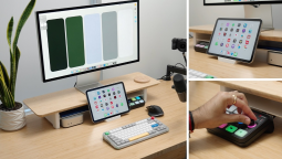
how to automate product design tasks with claude code
in 2026 weve got some cool new toys for our ux lab toolbox. i found a neat trick using claude code that can really speed up those repetitive coding and ui analysis jobs in the pipeline.basically, you set these little agents loose on common product design tasks like:
- auto-reviewing your team's css files
- checking if components are following consistent naming conventions
- analyzing how well a new component integrates with existing styles
these bots learn from examples to do things faster and more consistently than manual checks. kinda game-changing for keeping our designs in line without breaking the bank.
i tried it out on some basic stuff, like reviewing design tokens against my team's coding standards. worked great! now i can focus less on tedious tasks that dont require creativity.
so if youre looking to streamline your dev and ui processes with a bit of ai magic - definitely give this one try. what are y'all using for automation in the ux world? any cool tools or workflows?
anyone tried setting up their own coding bots yet?
link: https://uxplanet.org/how-to-automate-product-design-tasks-with-claude-code-5284b5e8c9e0?source=rss----819cc2aaeee0---4

design debt: lurking danger in every product decision
some might call it "technical" but for designers like us ⚡ design debt is just as real and costly. if you want to risk ai adoption, ignoring this could be your downfall.it doesn't announce itself until the cost of moving forward becomes too high - like a silent storm brewing below everyy product decision ️. i mean seriously. have shivers yet?
i've been thinking about how design debt sneaks in and cripples projects over time it's not just bad for user experience; ignoring these little niggling issues can snowball into huge problems later on.
anyone else dealing with this creepily slow build-up of technical & visual clutter, or is my project the only one that feels like a never-ending to-do list?
what strategies have you found effective in managing design debt and keeping projects moving smoothly ⬆️
https://uxdesign.cc/design-debt-is-now-as-dangerous-as-technical-debt-4b4166b9bc63?source=rss----138adf9c44c---4

human-centered design has definitely evolved over two decades since steve
in those early days of web development when 'dont make me think' was the mantra for so many designers , we focused on simplicity - great progress! but lets face it: tech today has become a double-edged sword. while convenience reigns supreme in our daily lives ⚡, at what cost?im curious if anyone else feels like theres been an ethical gap widening between technological advancements and human well-being . how can we bridge that divide going forward?
the next big challenge
how do you think designers should navigate this new landscape of responsibility towards society as a whole?
>maybe it's time for us to ask more questions about the impact our work has on people beyond just their immediate experience with digital products.
more here: https://uxdesign.cc/human-centred-design-has-grown-up-it-is-time-we-did-too-766601c1fc7d?source=rss----138adf9c44c---4
Designing for Accessibility in 2026
Incorporating dark mode is ''so passé. whats next?''Dark Mode
its everywhere now but it doesnt fully address everyone's needs. Accessibility
We need to go beyond just visual changes and really think about how our designs impact all users.
The New Frontier
Are we ready for dynamic color schemes that adapt based on the user's vision settings?
Or maybe even AI-driven adjustments?
>Imagine a future where your app auto-adjusts text size, contrast ratios. and font style to perfectly match each individual's needs.
Is this too much of an ask , or can we make it work without compromising performance?
User Experience is key here._

comprehensive guide to claude.md
i stumbled upon this super handy 'claude. md' file in our codebase and thought id share what its all abt. so basically, if youre diving into how things work w/ claudie (thats the codename for something cool were working on), start here.this guide covers everything from defining what claude is to explaining its role within claude code. there are some nitty-gritties like setup steps and best practices too. i found it really helpful, especially if youre new or just want a refresher
anyone else got tips on using this file? whats your go-to way of staying organized with project documentation in claude?
more here: https://uxplanet.org/comprehensive-guide-to-the-claude-md-8e60f860d9f9?source=rss----819cc2aaeee0---4

Web Animations Are The New Normal
Why Bother With Static UIs?in 2026 weve moved beyond just static interfaces - web animations, especially those built with css, have become a crucial part of every user's experience. theyre not only visually appealing but also significantly improve engagement and perception.
>Imagine scrolling through an app that feels stiff compared to one where elements smoothly slide into place as you interact.
>>Yeah. it's like the difference between walking on concrete versus grass
adobe after effects, once a go-to for complex animations, is now being replaced by css keyframes. the learning curve might be steeper at first but offers immense flexibility and performance benefits.
Key Takeaway : if youre not using some form of animation in your ui/ux design today - whether its loading states or subtle transitions - youre missing out on a big opportunity to enhance user satisfaction!
dive into the world where every interaction tells an invisible yet compelling story.

human-centred design has grown up ⚡
in 2006 or so , steve krug dropped three words that shaped a generation: don't make me think. it was radical then, but now we need to go beyond thinking and truly care about the people using our tech.the gap between technology and humanity is where years of harm were born ⚠️. in 2026, as ai becomes more integrated into everyday life , i wonder if design principles have kept up. are they still just focusing on not making users think, or do we need to dive deeper?
do you feel like our tools and platforms (like figma) haven't evolved enough? is it time for a new mantra beyond "don't make me think"? share your thoughts!
link: https://uxdesign.cc/human-centred-design-has-grown-up-it-is-time-we-did-too-766601c1fc7d?source=rss----138adf9c44c---4
designer empowerment
i've been thinking about this frustration that many designers face: you nail down a component with every detail thought through and then it comes back all messed up during dev. ai hasn't taught us to code, but rather handed control over the decisions we always had.imagine spending hours perfecting an animation's weight just for someone else's version of "it looks better." that feels like taking steps backward in progress ♂️
i wonder if this is a phase or here permanently. what do you guys think? have any tips on how to keep the creative vision intact during dev cycles?
keep your design intent strong and maybe even involve devs early for smoother integration!
https://uxdesign.cc/designers-finally-have-a-say-in-the-product-they-design-396c999e1227?source=rss----138adf9c44c---4

agentic design systems in 2026: figma basics go big
brad frost from atomic design and dominic nguyen of chromatic did a live demo called agential design systems ⚡. its all about how basic skills you thought were just for beginners are now the backbone of something massive! kyle, who runs developer experience at storybook team [storybook], was showing off their mcp-in-the.
i mean, ive been using figma basics forever but never imagined they'd turn into this. its like watching a seed grow
anyone else feeling left behind with all these new tools? what are your thoughts on agentic design systems?
found this here: https://uxdesign.cc/agentic-ai-design-systems-figma-a-practical-guide-6ab0b681718d?source=rss----138adf9c44c---4

error recovery in deepseek-r1 apps
i found this cool pattern for building resilient node. js react projects with DeepSeek-R1. it's all about setting up fallbacks and error handling to keep things smooth, even when stuff goes south ⚡ i love how you can notify users politely without scaring them off.one thing that stood out is the importance of graceful degradation - making sure your app still works well enough despite errors have anyone tried implementing this in a real project? what worked and didn't work for ya?
any tips or gotchas to share on error recovery with DeepSeek-R1 apps would be super helpful!
link: https://www.sitepoint.com/error-recovery-patterns-building-resilient-deepseekr1-applications/?utm_source=rss
A Game-Changer for Lazy Design Teams
figma's Auto Layout ' feature is a godsend but can be overused.it saves time on responsive designs ,but it comes with trade-offs.
for smaller screens, auto layouts may not look as polished and require extra tweaking.
here's the trick:
1. Use Auto layout for larger devices (e. g, desktops).
2. manually design'' components that are frequently used on mobile or tablets.
3. Create a separate frame ''' with custom designs to use when needed, making switching between screens easier and more controlled ️.
this wayyy you get the best of both worlds: quick responsive pages for larger devices while maintaining quality in crucial areas.
>Ever tried this? What's your experience been like?
Spoiler: i saved 3 hours per project by implementing these changes!
how to build a qr code generator with js: quick & easy
qr codes are everywhere nowadays! you scan them for websites or payments. most devs use online tools but why not make one yourself? it's surprisingly simple.first, grab this snippet:
[code]function generateqrcode(data) {
const url = `
data
)}`;
return `<img src="${url}" alt="qr code">`;
}
console. log(generateqrcode('
just plug in the link or text you want, and voilà! now go ahead & customize it for your project. anyone up to share their own qr code hacks?
ps: use other apis if this one doesn't suit ya
article: https://www.freecodecamp.org/news/how-to-build-a-qr-code-generator-using-javascript/

A Game-Changer for Form Validation Errors
when implementing form validation in UI/UX projects this year (2026), one big issue many face is how to handle error messages without disrupting user experience or :Figma ,
> :
-
. error-message {display: none;}, :
if (formValidationFailed) {document. querySelector('. error'). textContent = ' ';setTimeout(() => {$('. error-messages. error', )[0]. style. display= "block";},35); // , ,
!

ground's shaking: why designers need to rethink ai
something big has hit us in design land i feel like most of our community can sense it but maybe havent nailed down exactly whats going on. you know, that feeling when things are changing under your feet without a clear map.i was reading sonny's advice the other day and he had some great points about avoiding cliché ai imagery - no more robot hands or glowing brain scans! instead of falling back into those tropes (), lets think fresh. i mean, how often do we see that stuff anyway? it gets old real quick.
for anyone still stuck on neural net visuals from the 90s , maybe this is our chance to break free and create something truly innovative with ai integration in design
what are your thoughts or experiences when designing for smarter tech like chatbots, personal assistants - how do we keep it fresh? any cool examples out there?
share some ideas!
full read: https://uxdesign.cc/the-ground-is-shaking-why-designers-must-flip-the-script-on-ai-9211053bbadd?source=rss----138adf9c44c---4

design engineering's rise: a new chapter in ux design?
i stumbled upon this article that reallyy got me thinking about how 'lovable' products might be going out of style. it talks all about how design engineers are changing the game, moving beyond just being proficient at both visual and front-end dev but actually creating their own distinct discipline.the piece mentions design engineering is like a venn diagram where ux meets tech implementation - sounds pretty cool to me! i mean, who wouldn't want products that look amazing and work flawlessly?
i'm curious if anyone here has noticed more of these roles popping up in projects you've worked on. have your teams started hiring for this role or are they still sticking w/ traditional designer/dev splits?
any thoughts and experiences shared would be super helpful!
article: https://uxdesign.cc/design-engineers-ux-designs-demise-forget-your-lovable-products-e5ea71a15bad?source=rss----138adf9c44c---4
shared coding guidelines for ai & people too
i've been thinking about how we need to adjust our approach when it comes to creating clear and explicit coding standards . these aren't just rules but a way of ensuring consistency in both human-written code and the logic behind ai agents.for starters, i think making patterns more obvious is key - both for developers writing clean python or java scripts ⚡️, as well as designing ethical ai behaviors that are easily understood by all users. this means breaking down complex algorithms into simpler steps and maybe even using visual aids to explain them .
i wonder if there's a way we could create an open-source repository where everyone can contribute their best practices for both human coders and ai developers? it would be like having one big, collaborative guide that keeps evolving as our tech does
any thoughts on this idea or experiences you've had with similar initiatives in your projects?
curious to hear what others think!
[
// example of a clear coding guidelinefunction calculateAverage(scores) {return scores. reduce((acc, score) => acc + (score / len),0);}link: https://stackoverflow.blog/2026/03/26/coding-guidelines-for-ai-agents-and-people-too/

CSS Grid Layout Tricks
grid is a game changer for ui/ux design but can be overwhelming at first.use grid-template-columns/describe to define columns dynamically based on content width ⚡
figma's layout plugin" makes prototyping w/ css grid super easy, even if you're not an expert. but what happens when the plugin isn't available? here's a handy trick:
. grid-container {display: grid;/'' Define dynamic columns ''/grid-template-columns: repeat(auto-fill,minmax(20rem,max-content));}this snippet ensures your items stack responsively and adjust based on content, making it easy to create flexible layouts. no more fiddling with media queries or fixed widths!
>But wait. what if you want control over specific columns?
. grid-item {grid-column: span;}/'' Example ''/. item-1 {/'' spans two cols ''/}this allows fine-grained column management, giving flexibility where needed.
Conclusion
css grid is a powerful tool that can save you time and effort in layout design - just remember to keep things dynamic whenever possible!

Rethinking Dark Mode in 2026
dark mode has been a staple for years now ⚡ But is it as universally beneficial as we thought?In recent studies, researchers found that dark modes can actually increase eye strain under certain conditions. This raises the question: Is dark just better or does light have its own merits?
>Imagine scrolling through your social feed late at night The screen emits a warm glow instead of harsh blue tones. Figma's Night Mode, while well-intentioned, might not be as kind to our retinas. Testing shows that users experience less discomfort when using interfaces with balanced lighting options ⬆
So heres the hot take :
Switching your UI between light and dark modes dynamically based on user preferences or environmental factors could lead us out of this binary mindset.
What do you think? Are we ready to bid adieu ️ to our monochrome obsession?
// Example Codeif (environmentalLightLow) {setTheme('dark');} else if (userPreferenceDarkMode &&! nightTime()) { // Night mode off hourssetTheme(dynamicBasedOnUserHistory);} 
google stitch update ⚡
figma stocks took a hit this morning - down 12% after google launched its new ai design tool. my boss was all excited during our one-on-one today, talking about how things are changing in the industry again.i wonder what's next for figma and if other tools will follow suit with similar innovations.
anyone else noticed any shifts or changes recently?
more here: https://uxdesign.cc/google-stitch-design-maturity-guide-livable-products-f2c960170b07?source=rss----138adf9c44c---4

The Decline of Pop-Up Interactions
are they really worth it? Or are we just clicking away our UX progress?In 2016 pop-ups were all over websites - sign-up, subscribe, buy now. But have you noticed how few sites use them anymore?
I mean think about the last time a site asked for your email with '''a modal popup. Yeah. me neither.
The trend seems to be moving towards more seamless interactions where users don't even realize they're being prompted or guided through steps.
>Just browsing, then suddenly "sign up" blares at you. No thanks!
Instead of interrupting the user flow:
- Lazy loading images and content as needed
- Using tooltips for extra info
- Implementing inline forms where applicable
Pop-ups might be technically effective but they're a noisy relic.
Do we need to '''rethink our approach?
What do you think? Are popups totally out, or still hiding in plain sight somewhere?
Let me know below!
/'' If using Figma for prototyping this idea ''/. frame {padding:.5rem;} 
UI/UX Debate Lightning Round
figma vs sketch: the 2026 showdownboth tools are industry darlings but one must reign supreme in this era of rapid prototyping!
Why Figma is the Future
- Real-time Collaboration: with its cloud-based nature, teams can work together on projects seamlessly. no more waiting for file syncs!
> Sketch users: "What? I have to email files around now?"
''framer x: the new kid in town has everyone talking about smooth transitions and animations that feel like magic ✨
Sketch's Last Stand
- Elegant Interface: it's a pleasure just using the tool, with its clean design philosophy. figma can sometimes be overwhelming.
> "But does it really support all my plugins?"
''hot take: both tools have their strengths but in 2026? i'm giving figma an edge. its real-time features make team projects flow like a well-oiled machine.
Less is more with sketch, and that's why many designers still prefer it for its simplicity. but when you need to work fast without delays. figma wins hands down! ⚡
figma vs sketch? for now: [code]figma</code>, but let the discussion rage on in 2036!
-
sketch will always have its fans for sure. it's just that real-time collaboration is hard to beat these days!~ ~
Discuss your take below - what do you think?

claud code modes for product designers
ive been playing around with claude's different coding modes lately, especially when working in figma and thought id share some quick tips.ask permissions ⬆️ - makes sure you get user consent b4 making changes. useful if u want to ensure users are okay every time.
auto accept edits ➡️ - speeds up the process by automatically accepting minor tweaks without prompting, perfect for small adjustments or when working with clients who prefer a hands-off approach.
bypass permissions ⬇️ - bypasses user consent checks entirely (use this one wisely! ) its great in emergency situations but can be risky if not handled carefully.
auto mode ✨ - runs on autopilot and is perfect for repetitive tasks. you set the rules, then let claude handle everything else.
ive found that using these modes together really streamlines my workflow without sacrificing user privacy or consent ⭐. anyone out there experimenting with different settings? share your experiences!
whats been working well in terms of balance btwn efficiency and respectfulness for users' choices?
anyone got other cool tricks up their sleeves to make product design even smoother?
chime in if youve tried these modes too or have some new ideas!
article: https://uxplanet.org/claude-code-modes-including-the-latest-auto-mode-cfe85078e359?source=rss----819cc2aaeee0---4
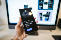
chatbots take over site search
i've been playing around w/ chatgpt-style answers lately it's crazy how quickly conversational ui is becoming a norm. i mean c'mon, who would have thought we'd see this in just 4 years? the likes of claude and gemini are really pushing boundaries.the shift feels huge for site search too. suddenly people expect their queries to be answered like they're chatting with an actual person instead of sifting through a list i'm curious, has anyone tried integrating chatgpt-style responses into your website's. search yet? how did it go?
i've been thinking abt adding this feature but not sure where exactly. any tips on what works best or pitfalls to avoid would be super helpful!
more here: https://uxplanet.org/why-chatgpt-style-answers-are-the-future-of-site-search-and-how-to-add-it-to-your-website-b5d3b7bc9206?source=rss----819cc2aaeee0---4

when ai fails us
i found this really interesting case where a chatbot mishandled someone's dad's passing . jake moffatt lost his father and needed to book last-minute flights, but air canada's bot couldnt help him with bereavement fares.this got me thinking about accountability in ai-designed experiences . who do we blame when things go wrong? the designer ⚫️, project manager pm ▲ ,vendor or company board ? it seems everyone points fingers at each other.
i wonder if theres a better way to handle these situations, especially for sensitive issues like bereavement support . any thoughts on how we can improve this?
more here: https://uxdesign.cc/when-ai-experiences-fail-who-is-held-accountable-3f07ce9e6032?source=rss----138adf9c44c---4

feature fail blues
i was digging through some stats from pendo's feature adoption report 2069 ⚡ and it hit me: roughly 8 out of every 10 features shipped are barely used or not at all after launch. thats a pretty stark reminder to get our release processes right.imagine spending months on something only for users to ignore the hell outta your hard work . i mean, sure we can tweak and iterate based on user feedback ⭐ but how do you ensure those initial launches hit their mark?
anyone else stumble upon some killer patterns or checkpoints that've helped keep feature failures at bay?
full read: https://vwo.com/blog/feature-release-failures-prevention-guide/

